97 Out of 100 Visitors Leave Without Converting. The Problem Isn't Your Traffic.
97 Out of 100 Visitors Leave Without Converting. The Problem Isn't Your Traffic.
Last Updated:
Table of Content
Case Studies



Nikhil Burani
Nikhil Burani
Nikhil Burani
SEO
SEO
SEO
10 Min Read
25 Min
10 Min Read
Most conversion problems get diagnosed wrong. Businesses spend more on ads, tweak button colors, and wonder why nothing moves. The real issue is usually somewhere else.
The global average e-commerce conversion rate is 2.66%, according to Dynamic Yield's 2025 benchmark data. On average, 97 out of every 100 people who visit a website leave without completing the action the business wanted.
That gap isn't a traffic problem. The visitors are showing up. Something on the page, in the flow, or in the experience is sending them away before they act.
The usual response is to spend more on ads or run A/B tests on button colors and hero images. Neither one touches the actual problem, which turns out to be simpler and more uncomfortable than most businesses want to admit.
Fixing it means figuring out where people actually get stuck, not repainting the CTA and hoping. That's what proper conversion optimization actually does: find the friction, then fix it.
What the Conversion Gap Actually Looks Like Across Industries
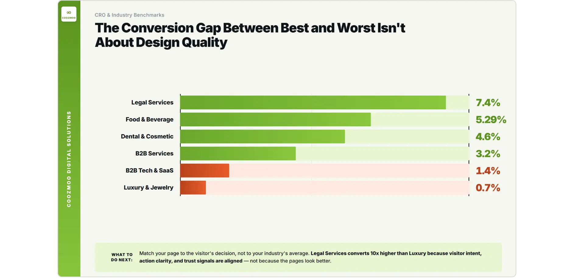
Conversion rates vary a lot by industry, and the gap between the best and worst performers says something about what actually drives a decision.
Industry | Average Conversion Rate 2025 | What This Tells You |
|---|---|---|
Food and Beverage | 0.05 | Low consideration, high urgency, familiar action |
Legal Services | 0.07 | High intent traffic, one clear action, strong trust signals |
Dental and Cosmetic | 0.05 | Local, appointment-based, easy next step |
B2B Services | 0.03 | Relationship-driven, longer consideration |
B2B Tech and SaaS | 1.1% to 1.4% | High research burden, complex decision, long cycle |
Luxury and Jewelry | 0.01 | High consideration, trust-sensitive, desktop-preferred |
The pattern isn't about design quality. Food and Beverage and Legal Services aren't winning because their pages look better. They're winning because visitor intent is high, the required action is simple, and the path to that action is short. B2B SaaS sits at 1.1% not because the product is bad, but because the decision is complex, the research phase drags on, and most landing pages aren't built for that reality.
Businesses losing conversions are often trying to force a high-consideration decision through a low-consideration page. They've built the checkout for the conversion they want, not the decision the visitor is actually making.
The Real Reason Most Landing Pages Fail
Most businesses conflate two separate problems here, and solving the wrong one first burns time and budget.
Breaking patterns users already have
Every visitor brings years of trained behavior to a website. They expect the navigation in a certain spot, a checkout flow that behaves a certain way, a contact form somewhere findable. None of that is preference. It's pattern, built from thousands of prior visits to other sites.
Break those patterns for the sake of a creative redesign, and a visitor's brain registers friction right away, though rarely as a conscious thought. They don't think "this is unusual." They just feel like something's slightly off, and their momentum stalls. Baymard Institute's checkout research, built on usability testing across thousands of e-commerce flows, keeps identifying broken familiar patterns as one of the leading causes of abandonment: a step that shouldn't be there, a field in the wrong place, navigation that doesn't behave the way it's supposed to. Each one adds a small amount of resistance the visitor never consciously names.
In practice, this shows up as a contact page that doesn't look like one, a checkout redesigned to feel unique, or navigation reimagined to express the brand's personality. Each of those choices puts creative expression ahead of the visitor's ability to finish the task they came to do.
Desperation design versus guidance design
The second problem is subtler and shows up more often. A landing page can be openly desperate: a popup firing three seconds after arrival, a countdown timer that resets when you come back, CTAs stacked on top of each other, a discount banner before you've read a single line about the product. Pages like this are built around the business's anxiety about conversion, not the visitor's actual decision-making process.
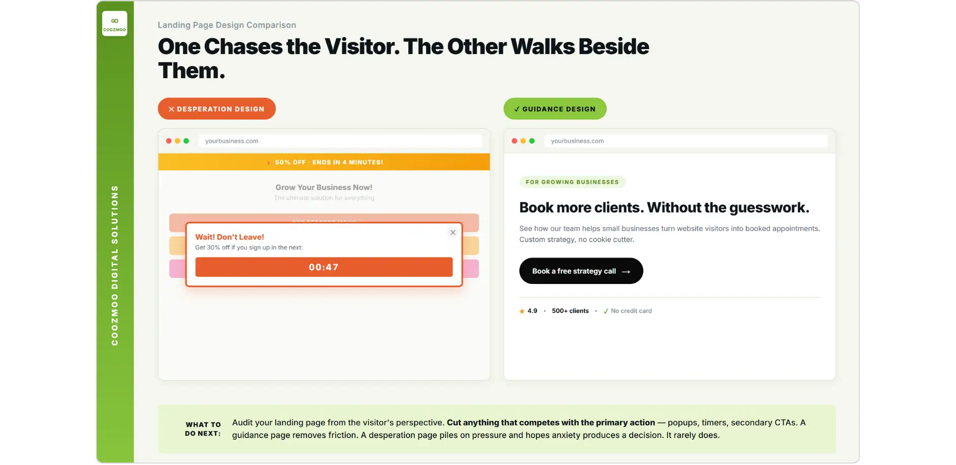
A page that converts well doesn't feel urgent. It feels clear. That's the difference between a salesperson who grabs your arm and one who walks beside you and makes the next step obvious. The visitor should feel guided, not chased.
Nielsen Norman Group's research on conversion and UX makes the point directly: conversion is a user outcome, and confusion or anxiety anywhere in the page flow kills completion. The page's job is to reduce both, not pile on pressure and hope it produces a decision.

Intent Determines the Device. The Device Should Determine the Page.
One of the most misunderstood dynamics in conversion optimization is the mobile-versus-desktop gap. Mobile drives 64% of web traffic, yet desktop converts 2.17 times better, according to 2026 data from Statnive. Most businesses see that gap and conclude they need a better mobile experience. That's only half the answer.
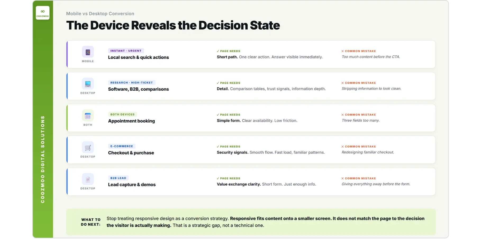
Mobile and desktop aren't just different screen sizes. They're different decision-making contexts.
A mobile visitor searching for food nearby, checking a local service, or looking up a phone number is in a high-urgency, low-consideration state. They want an answer now, and they'll convert if the path is short enough. That's part of why Food and Beverage sites convert at 5.29% and local service businesses do even better despite being mostly mobile audiences. Intent matches the device.
A desktop visitor comparing software, reading specs, or evaluating a B2B vendor is in research mode. They need more information, more room to compare, and more trust signals before they act. Push that visitor through a condensed, mobile-style page and you strip out exactly the information density they need to decide.
Most businesses design one page for both. Responsive design solves the technical problem of fitting content onto a smaller screen. It doesn't solve the strategic problem of matching the page experience to the decision someone is actually making.
Decision Type | Preferred Device | What the Page Needs | Common Mistake |
|---|---|---|---|
Instant, local, urgent | Mobile | Short path, one clear action, immediate answer | Too much content before the CTA |
Research-heavy, high-ticket | Desktop | Detail, comparison, trust signals, depth | Stripping information to look clean |
Appointment booking | Both | Simple form, clear availability, low friction | Too many form fields |
E-commerce checkout | Desktop preferred | Security signals, smooth flow, fast load | Redesigning familiar checkout patterns |
Lead capture, B2B | Desktop preferred | Value exchange clarity, short form | Giving everything away before the form |
Conversion Is Not One Thing. Treat It That Way.
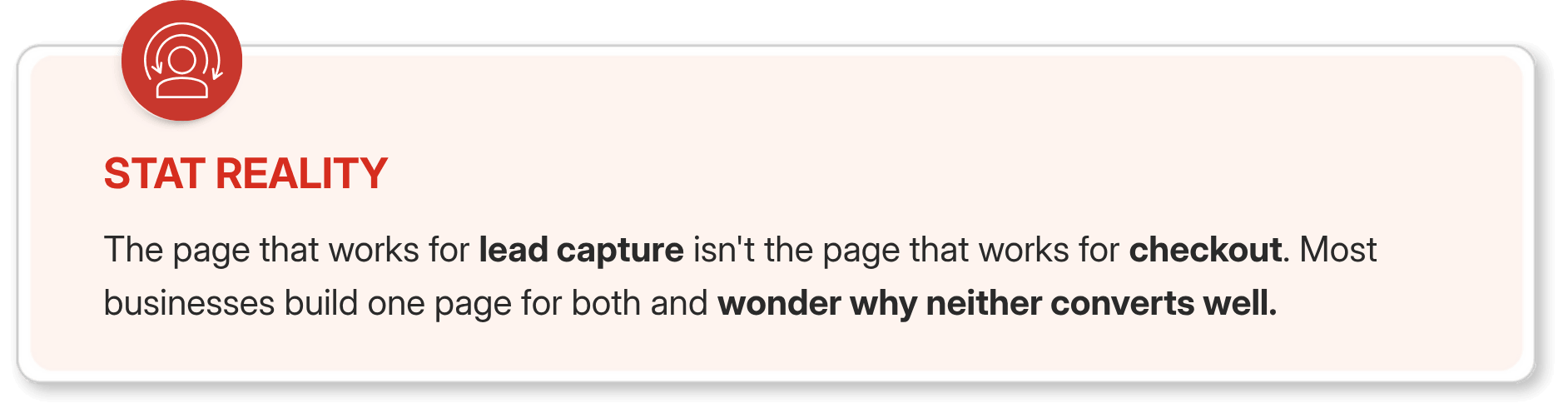
One of the most overlooked problems in CRO is treating conversion as if it means the same thing on every page, for every business.
A lead, a booked appointment, a free trial signup, and a demo request are four different outcomes, each with its own information requirement, its own friction profile, and its own psychological moment to hit.
Lead generation pages face a genuine tension: give away everything the visitor came to learn, and they have no reason to hand over contact details. The page needs to build enough trust to be credible while holding back enough to justify the next step. Miss that balance in either direction or conversion suffers. Too much information and the visitor take it and leaves. Too little and they don't trust the business enough to share their details.
E-commerce purchase pages face a completely different friction profile. Baymard Institute's research points to unexpected costs, extra steps, and clunky forms as the leading causes of checkout abandonment. Security and trust requirements run higher here, and payment confirmation has to be immediate and clear. A visitor who pays and then sees an error message, or never gets a confirmation email, doesn't just abandon the purchase. They call their bank and dispute the charge.
Appointment booking has a lower bar on both counts. The ask is smaller, the commitment is reversible, and the form should be as short as the business can make it while still collecting what it needs. Most booking pages still have three fields too many.
Where Most CRO Budget Goes Wrong
Testing priorities at most CRO programs are backwards. Most A/B tests run in 2025 target cosmetic elements: button color, hero image, headline wording, font size. They're easy to set up and easy to explain to stakeholders, and they're also the least likely to move the needle.
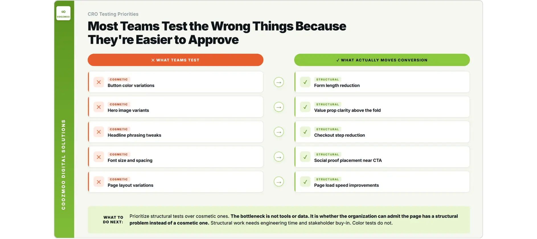
Brillmark's review of 200 e-commerce experiments in 2025 found the most repeated winners were sticky mobile CTAs, above-the-fold value proposition clarity, and review prominence near the decision point, not button colors or hero image swaps. What consistently won were the elements that directly cut how much effort a visitor needed to understand and act.
Ascend2's 2025 A/B testing research confirms experimentation is still central to marketing optimization, but there's a real gap between what teams test and what actually moves conversion. The elements that reliably shift conversion are the ones most teams avoid, because the changes feel too large or too structural to approve easily.
What Most Teams Test | What Actually Moves Conversion | Why the Gap Exists |
|---|---|---|
Button color | Form length reduction | Color tests are easy, form restructures are not |
Hero image variants | Value proposition clarity above the fold | Image swaps feel safer than rewriting the headline |
Headline phrasing | Checkout step reduction | Copy tests are fast, flow changes require dev work |
Font size and spacing | Social proof placement near the CTA | Design tweaks feel lower risk than structural changes |
Page layout | Page load speed improvement | Speed work lives in engineering, not marketing |
Cosmetic tests dominate CRO budgets not because they work better, but because they're easier to approve, build, and explain. Structural changes need engineering time, buy-in from stakeholders, and a willingness to admit the current flow is fundamentally broken.
That willingness is the real bottleneck, not the tools or the data. It comes down to whether the organization can admit the page has a structural problem instead of a cosmetic one.
Speed Is Not a Nice-to-Have. It Is a Conversion Prerequisite.
Every extra second of load time raises the odds a visitor leaves before reading a word. None of this is new, but the scale of the problem in 2026 is bigger than most businesses realize.
Only 22% of websites currently pass all three Core Web Vitals thresholds, according to 2025 performance research, and the conversion losses tied to weak performance run from 8% to 35% depending on the site and traffic source. On paid landing pages, where every visitor costs money, a slow load isn't just a UX complaint. It's a direct hit to revenue.
Mobile takes the worst of it. The same device that drives 64% of traffic is also the one most likely to be on a slower connection, with less processing power, held by someone with the least patience to wait. A desktop user on broadband will tolerate two seconds of load time. A mobile user on a shaky 4G connection has often already decided by 1.5 seconds.
Businesses winning on mobile conversion aren't winning with more persuasive pages. They're winning because the page loads inside the visitor's patience window and puts the single most important action on screen without a scroll.
What a Page Built Around the User Actually Looks Like
The clearest way to see what a high-converting page does differently is to think of it as hospitality rather than persuasion.
A good host doesn't grab you at the door and shove a drink into your hand. They welcome you, make the space feel comfortable, point out where things are, and let you move toward what you came for at your own pace. The next step stays visible the whole time, and the space itself tells you you're in the right place.
That's what a high-converting landing page does too. The value proposition sits above the fold, immediately clear. The next action is obvious and within reach. Trust signals sit near the decision point instead of buried at the bottom. The form asks for the minimum information needed to start the relationship, and confirmation of the action arrives fast and clearly.
Anything that competes with the primary action gets cut. What's left either moves the visitor toward conversion or builds enough trust to make the conversion feel safe, and none of it is there just because it looks good.
That's the real difference between a page built around what the business wants someone to do and a page built around what the visitor needs in order to do it. One creates friction. The other removes it.
FAQs
What is a good conversion rate for a landing page in 2026?

It depends on the industry and the type of conversion you're measuring. Global e-commerce averages sit around 2.66%, but Food and Beverage converts at 5.29% and Legal Services at 7.4%, while B2B SaaS runs 1.1% to 1.4%, according to Dynamic Yield and First Page Sage data from 2025. A good conversion rate is one that's improving against your own baseline, benchmarked to your industry and traffic source. Comparing a B2B software landing page to a food delivery checkout doesn't tell you much.
Why does my mobile traffic not convert even though it is most of my visitors?
Mobile and desktop convert differently because the decision-making context is different. Mobile visitors who convert well are usually in a high-urgency, low-consideration situation, like a local search, a quick purchase, or an appointment booking. Complex, high-research decisions still convert better on desktop, because visitors need more information, more room to compare, and more time. If your product needs research before a decision, your mobile page should move visitors into consideration rather than force an immediate conversion.
What elements should I test first to improve conversion rate?
Start with the structural elements that directly affect a visitor's ability to understand and act: form length, checkout step count, value proposition clarity above the fold, and social proof placement near the CTA. Button color and hero image tests are easy to run but rarely move much. Brillmark's review of over 200 e-commerce experiments in 2025 found sticky mobile CTAs, review prominence, and above-the-fold clarity among the most consistent winners. Fix the path before you touch the aesthetics.
How much does page speed affect conversion rate?
Quite a bit, especially on mobile and paid traffic pages. Only 22% of websites pass all three Core Web Vitals thresholds in 2025, and the associated conversion losses run 8% to 35% depending on the site. Every additional second of load time raises abandonment risk before a visitor has even seen your messaging. On paid traffic, where each visitor has a real cost, a slow page is a direct revenue loss, not a technical nice-to-have.
Should I give all the information on a landing page or hold some back to generate leads?
It depends on what you're optimizing for. For lead generation, holding some information back is a legitimate strategy: if the page answers every question, the visitor has no reason to leave contact details. The page needs to show enough value to earn trust while leaving enough curiosity to justify the next step. For e-commerce or appointment booking, it's the opposite. Giving visitors everything they need to feel confident reduces abandonment. The mistake is applying the same information strategy to every type of conversion regardless of what the visitor actually needs to decide.
Most conversion problems get diagnosed wrong. Businesses spend more on ads, tweak button colors, and wonder why nothing moves. The real issue is usually somewhere else.
The global average e-commerce conversion rate is 2.66%, according to Dynamic Yield's 2025 benchmark data. On average, 97 out of every 100 people who visit a website leave without completing the action the business wanted.
That gap isn't a traffic problem. The visitors are showing up. Something on the page, in the flow, or in the experience is sending them away before they act.
The usual response is to spend more on ads or run A/B tests on button colors and hero images. Neither one touches the actual problem, which turns out to be simpler and more uncomfortable than most businesses want to admit.
Fixing it means figuring out where people actually get stuck, not repainting the CTA and hoping. That's what proper conversion optimization actually does: find the friction, then fix it.
What the Conversion Gap Actually Looks Like Across Industries
Conversion rates vary a lot by industry, and the gap between the best and worst performers says something about what actually drives a decision.
Industry | Average Conversion Rate 2025 | What This Tells You |
|---|---|---|
Food and Beverage | 0.05 | Low consideration, high urgency, familiar action |
Legal Services | 0.07 | High intent traffic, one clear action, strong trust signals |
Dental and Cosmetic | 0.05 | Local, appointment-based, easy next step |
B2B Services | 0.03 | Relationship-driven, longer consideration |
B2B Tech and SaaS | 1.1% to 1.4% | High research burden, complex decision, long cycle |
Luxury and Jewelry | 0.01 | High consideration, trust-sensitive, desktop-preferred |
The pattern isn't about design quality. Food and Beverage and Legal Services aren't winning because their pages look better. They're winning because visitor intent is high, the required action is simple, and the path to that action is short. B2B SaaS sits at 1.1% not because the product is bad, but because the decision is complex, the research phase drags on, and most landing pages aren't built for that reality.
Businesses losing conversions are often trying to force a high-consideration decision through a low-consideration page. They've built the checkout for the conversion they want, not the decision the visitor is actually making.
The Real Reason Most Landing Pages Fail
Most businesses conflate two separate problems here, and solving the wrong one first burns time and budget.
Breaking patterns users already have
Every visitor brings years of trained behavior to a website. They expect the navigation in a certain spot, a checkout flow that behaves a certain way, a contact form somewhere findable. None of that is preference. It's pattern, built from thousands of prior visits to other sites.
Break those patterns for the sake of a creative redesign, and a visitor's brain registers friction right away, though rarely as a conscious thought. They don't think "this is unusual." They just feel like something's slightly off, and their momentum stalls. Baymard Institute's checkout research, built on usability testing across thousands of e-commerce flows, keeps identifying broken familiar patterns as one of the leading causes of abandonment: a step that shouldn't be there, a field in the wrong place, navigation that doesn't behave the way it's supposed to. Each one adds a small amount of resistance the visitor never consciously names.
In practice, this shows up as a contact page that doesn't look like one, a checkout redesigned to feel unique, or navigation reimagined to express the brand's personality. Each of those choices puts creative expression ahead of the visitor's ability to finish the task they came to do.
Desperation design versus guidance design
The second problem is subtler and shows up more often. A landing page can be openly desperate: a popup firing three seconds after arrival, a countdown timer that resets when you come back, CTAs stacked on top of each other, a discount banner before you've read a single line about the product. Pages like this are built around the business's anxiety about conversion, not the visitor's actual decision-making process.
A page that converts well doesn't feel urgent. It feels clear. That's the difference between a salesperson who grabs your arm and one who walks beside you and makes the next step obvious. The visitor should feel guided, not chased.
Nielsen Norman Group's research on conversion and UX makes the point directly: conversion is a user outcome, and confusion or anxiety anywhere in the page flow kills completion. The page's job is to reduce both, not pile on pressure and hope it produces a decision.
Intent Determines the Device. The Device Should Determine the Page.
One of the most misunderstood dynamics in conversion optimization is the mobile-versus-desktop gap. Mobile drives 64% of web traffic, yet desktop converts 2.17 times better, according to 2026 data from Statnive. Most businesses see that gap and conclude they need a better mobile experience. That's only half the answer.
Mobile and desktop aren't just different screen sizes. They're different decision-making contexts.
A mobile visitor searching for food nearby, checking a local service, or looking up a phone number is in a high-urgency, low-consideration state. They want an answer now, and they'll convert if the path is short enough. That's part of why Food and Beverage sites convert at 5.29% and local service businesses do even better despite being mostly mobile audiences. Intent matches the device.
A desktop visitor comparing software, reading specs, or evaluating a B2B vendor is in research mode. They need more information, more room to compare, and more trust signals before they act. Push that visitor through a condensed, mobile-style page and you strip out exactly the information density they need to decide.
Most businesses design one page for both. Responsive design solves the technical problem of fitting content onto a smaller screen. It doesn't solve the strategic problem of matching the page experience to the decision someone is actually making.
Decision Type | Preferred Device | What the Page Needs | Common Mistake |
|---|---|---|---|
Instant, local, urgent | Mobile | Short path, one clear action, immediate answer | Too much content before the CTA |
Research-heavy, high-ticket | Desktop | Detail, comparison, trust signals, depth | Stripping information to look clean |
Appointment booking | Both | Simple form, clear availability, low friction | Too many form fields |
E-commerce checkout | Desktop preferred | Security signals, smooth flow, fast load | Redesigning familiar checkout patterns |
Lead capture, B2B | Desktop preferred | Value exchange clarity, short form | Giving everything away before the form |
Conversion Is Not One Thing. Treat It That Way.
One of the most overlooked problems in CRO is treating conversion as if it means the same thing on every page, for every business.
A lead, a booked appointment, a free trial signup, and a demo request are four different outcomes, each with its own information requirement, its own friction profile, and its own psychological moment to hit.
Lead generation pages face a genuine tension: give away everything the visitor came to learn, and they have no reason to hand over contact details. The page needs to build enough trust to be credible while holding back enough to justify the next step. Miss that balance in either direction or conversion suffers. Too much information and the visitor take it and leaves. Too little and they don't trust the business enough to share their details.
E-commerce purchase pages face a completely different friction profile. Baymard Institute's research points to unexpected costs, extra steps, and clunky forms as the leading causes of checkout abandonment. Security and trust requirements run higher here, and payment confirmation has to be immediate and clear. A visitor who pays and then sees an error message, or never gets a confirmation email, doesn't just abandon the purchase. They call their bank and dispute the charge.
Appointment booking has a lower bar on both counts. The ask is smaller, the commitment is reversible, and the form should be as short as the business can make it while still collecting what it needs. Most booking pages still have three fields too many.
Where Most CRO Budget Goes Wrong
Testing priorities at most CRO programs are backwards. Most A/B tests run in 2025 target cosmetic elements: button color, hero image, headline wording, font size. They're easy to set up and easy to explain to stakeholders, and they're also the least likely to move the needle.
Brillmark's review of 200 e-commerce experiments in 2025 found the most repeated winners were sticky mobile CTAs, above-the-fold value proposition clarity, and review prominence near the decision point, not button colors or hero image swaps. What consistently won were the elements that directly cut how much effort a visitor needed to understand and act.
Ascend2's 2025 A/B testing research confirms experimentation is still central to marketing optimization, but there's a real gap between what teams test and what actually moves conversion. The elements that reliably shift conversion are the ones most teams avoid, because the changes feel too large or too structural to approve easily.
What Most Teams Test | What Actually Moves Conversion | Why the Gap Exists |
|---|---|---|
Button color | Form length reduction | Color tests are easy, form restructures are not |
Hero image variants | Value proposition clarity above the fold | Image swaps feel safer than rewriting the headline |
Headline phrasing | Checkout step reduction | Copy tests are fast, flow changes require dev work |
Font size and spacing | Social proof placement near the CTA | Design tweaks feel lower risk than structural changes |
Page layout | Page load speed improvement | Speed work lives in engineering, not marketing |
Cosmetic tests dominate CRO budgets not because they work better, but because they're easier to approve, build, and explain. Structural changes need engineering time, buy-in from stakeholders, and a willingness to admit the current flow is fundamentally broken.
That willingness is the real bottleneck, not the tools or the data. It comes down to whether the organization can admit the page has a structural problem instead of a cosmetic one.
Speed Is Not a Nice-to-Have. It Is a Conversion Prerequisite.
Every extra second of load time raises the odds a visitor leaves before reading a word. None of this is new, but the scale of the problem in 2026 is bigger than most businesses realize.
Only 22% of websites currently pass all three Core Web Vitals thresholds, according to 2025 performance research, and the conversion losses tied to weak performance run from 8% to 35% depending on the site and traffic source. On paid landing pages, where every visitor costs money, a slow load isn't just a UX complaint. It's a direct hit to revenue.
Mobile takes the worst of it. The same device that drives 64% of traffic is also the one most likely to be on a slower connection, with less processing power, held by someone with the least patience to wait. A desktop user on broadband will tolerate two seconds of load time. A mobile user on a shaky 4G connection has often already decided by 1.5 seconds.
Businesses winning on mobile conversion aren't winning with more persuasive pages. They're winning because the page loads inside the visitor's patience window and puts the single most important action on screen without a scroll.
What a Page Built Around the User Actually Looks Like
The clearest way to see what a high-converting page does differently is to think of it as hospitality rather than persuasion.
A good host doesn't grab you at the door and shove a drink into your hand. They welcome you, make the space feel comfortable, point out where things are, and let you move toward what you came for at your own pace. The next step stays visible the whole time, and the space itself tells you you're in the right place.
That's what a high-converting landing page does too. The value proposition sits above the fold, immediately clear. The next action is obvious and within reach. Trust signals sit near the decision point instead of buried at the bottom. The form asks for the minimum information needed to start the relationship, and confirmation of the action arrives fast and clearly.
Anything that competes with the primary action gets cut. What's left either moves the visitor toward conversion or builds enough trust to make the conversion feel safe, and none of it is there just because it looks good.
That's the real difference between a page built around what the business wants someone to do and a page built around what the visitor needs in order to do it. One creates friction. The other removes it.
FAQs
What is a good conversion rate for a landing page in 2026?
It depends on the industry and the type of conversion you're measuring. Global e-commerce averages sit around 2.66%, but Food and Beverage converts at 5.29% and Legal Services at 7.4%, while B2B SaaS runs 1.1% to 1.4%, according to Dynamic Yield and First Page Sage data from 2025. A good conversion rate is one that's improving against your own baseline, benchmarked to your industry and traffic source. Comparing a B2B software landing page to a food delivery checkout doesn't tell you much.
Why does my mobile traffic not convert even though it is most of my visitors?
Mobile and desktop convert differently because the decision-making context is different. Mobile visitors who convert well are usually in a high-urgency, low-consideration situation, like a local search, a quick purchase, or an appointment booking. Complex, high-research decisions still convert better on desktop, because visitors need more information, more room to compare, and more time. If your product needs research before a decision, your mobile page should move visitors into consideration rather than force an immediate conversion.
What elements should I test first to improve conversion rate?
Start with the structural elements that directly affect a visitor's ability to understand and act: form length, checkout step count, value proposition clarity above the fold, and social proof placement near the CTA. Button color and hero image tests are easy to run but rarely move much. Brillmark's review of over 200 e-commerce experiments in 2025 found sticky mobile CTAs, review prominence, and above-the-fold clarity among the most consistent winners. Fix the path before you touch the aesthetics.
How much does page speed affect conversion rate?
Quite a bit, especially on mobile and paid traffic pages. Only 22% of websites pass all three Core Web Vitals thresholds in 2025, and the associated conversion losses run 8% to 35% depending on the site. Every additional second of load time raises abandonment risk before a visitor has even seen your messaging. On paid traffic, where each visitor has a real cost, a slow page is a direct revenue loss, not a technical nice-to-have.
Should I give all the information on a landing page or hold some back to generate leads?
It depends on what you're optimizing for. For lead generation, holding some information back is a legitimate strategy: if the page answers every question, the visitor has no reason to leave contact details. The page needs to show enough value to earn trust while leaving enough curiosity to justify the next step. For e-commerce or appointment booking, it's the opposite. Giving visitors everything they need to feel confident reduces abandonment. The mistake is applying the same information strategy to every type of conversion regardless of what the visitor actually needs to decide.



Summarize with AI



Want to Skyrocket Revenue? Get a Free Audit Today!
Want to Skyrocket Revenue? Get a Free Audit Today!



4.9/5 Ratings!


Don’t miss our revenue growth tips!
Get expert marketing tips—straight to your inbox, like thousands of happy clients.
Don’t miss our revenue growth tips!
Get expert marketing tips—straight to your inbox, like thousands of happy clients.
Don’t miss our revenue growth tips!
Don’t miss our revenue growth tips!
Get expert marketing tips—straight to your inbox, like thousands of happy clients.
Relevant Blogs on Organic SEO
Relevant Blogs on Organic SEO
Unlock data-driven insights in Organic SEO—explore our featured blogs and skyrocket your revenue before your competitors do.
Unlock data-driven insights in Organic SEO—explore our featured blogs and skyrocket your revenue before your competitors do.

SEO
Sep 21, 2026
5 Min Read
Audience-First SEO: How to Rank by Putting Readers First
SEO
Sep 21, 2026
5 Min Read
Audience-First SEO: How to Rank by Putting Readers First
SEO
Sep 21, 2026
5 Min Read
Audience-First SEO: How to Rank by Putting Readers First

SEO
Sep 19, 2026
5 Min Read
How to Add SEO Keywords to Your Website: Where and How
SEO
Sep 19, 2026
5 Min Read
How to Add SEO Keywords to Your Website: Where and How
SEO
Sep 19, 2026
5 Min Read
How to Add SEO Keywords to Your Website: Where and How
SEO
Sep 18, 2026
5 Min Read
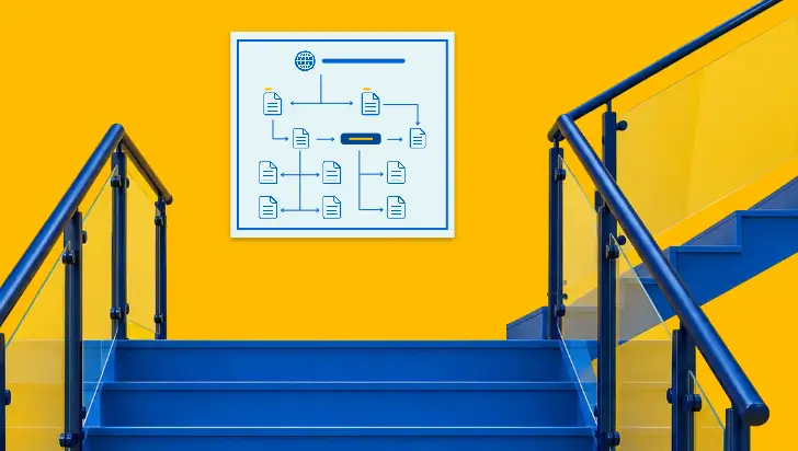
How XML Sitemaps Help Search Engines Discover New Pages
SEO
Sep 18, 2026
5 Min Read
How XML Sitemaps Help Search Engines Discover New Pages
SEO
Sep 18, 2026
5 Min Read
How XML Sitemaps Help Search Engines Discover New Pages


























Ready to speak with an expert?
Data-Driven Marketing Agency That Elevates ROI
1100+
Websites Designed & Optimized to Convert
$280M+
Client Revenue Driven & Growing Strong
Discover how to skyrocket
your revenue today!
Trusted by 1000+ Owners!
Ready to speak with an expert?
Data-Driven Marketing Agency That Elevates ROI
1100+
Websites Designed & Optimized to Convert
$280M+
Client Revenue Driven & Growing Strong
Discover how to skyrocket
your revenue today!
Trusted by 1000+ Owners!
Want to skyrocket revenue?
4.9/5 Ratings!
Ready to speak with an expert?
Data-Driven Marketing Agency That Elevates ROI
1100+
Websites Designed & Optimized to Convert
$280M+
Client Revenue Driven & Growing Strong
Discover how to skyrocket
your revenue today!
Trusted by 1000+ Owners!
Call
Meet